Adobe Photoshop Civil Rights Movement Picture
Critical C's
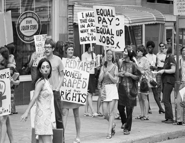
Concept
This project appealed to me because I like using Photoshop. I disliked that I had to be in this photo. It might not be apparent to the viewing audience that I didn't take my ear or neck into this photo, only my face.
Composition
I used the elements color, texture, and value and the principles contrast, balance, and unity in my composition. My artwork is a reflection about society because it is a women's right protest from the past. The most dominant principle I used is the unity of the black-and-white and grainy elements and it affected the composition by tying it all together. I used Adobe Photoshop.
Craftsmanship
After I understood the assignment I developed my idea by thinking about what civil rights movements I would've been a part of. I searched the internet to find pictures of those movements and tried to find out that would be easy for me to put myself into. To make this, I opened Photoshop, made a new document, and placed my civil rights photo. Then I took and uploaded a photo of me and open it in Photoshop. I cut just my face out with the lasso tool and dragged it into the civil rights photo. Then I re-sized it and messed with the contrast, exposure, etc. until it looked okay. A problem I encountered is that it doesn't look real and I don't know why. I couldn't fix it. I think it's because the photo of my face is just so much higher quality than the rest of the photo, and maybe the shadows are off.
Creativity
I was pretty committed to this project because I was frustrated that it didn't look how I wanted it to. I moved beyond just what the teacher asked of me by adding grain to the photo of my face to try to get the quality down. I used old techniques that I already knew in Photoshop like adding photo adjustments, and new techniques like using the lasso tool and dragging my face into another photo. I related to this assignment because I believe in women's rights, so this movement was very important to me.
Completeness
I changed my artwork a lot of times by messing with the colors and such after everyone said that it doesn't look real, I stick out, etc. I reflected on the elements of color by making it black and white and messed with exposure and contrast, texture by adding grain, and value by messing with the shadows/highlights. I reflected on the principles of contrast by changing the contrast a lot, balance by trying to make it all look the same and balanced, and unity by trying to tie it all together with a similar appearance. I knew I was finished when I kept trying to make it look better but nothing I did was really doing anything to change it. I am embarrassed/frustrated about this artwork because it looks pretty stupid and I don't like it.
