Adobe Illustrator Self-Portrait
Critical C's
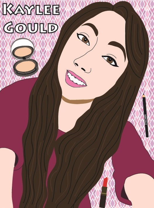
Concept
This project appealed to me because I got to draw myself and try to make it actually look like me. I disliked drawing hair because it's hard to make it look realistic. It is not apparent to viewers that there was actually something blocking the bottom half of my torso in the photo, and that I had to free-hand all of that.
Composition
I used the elements line in my hair and outlining features, color in all of my closed shapes, texture in my hair, value in shadows, and shape in all of my closed figures. I used the principles contrast in my dark hair and pale skin, emphasis on my eyes outlined with winged eyeliner, pattern in my background, and unity because mostly all of my photo is pink-toned. My artwork is a personal reflection because it is of myself and there are makeup products in the background because I like makeup a lot. The most dominant principle I used is the unity of the pink-toned colors in my shirt, lips, and background; the sense of unity pulls the picture together. I used Adobe Illustrator.
Craftsmanship
I developed my idea by looking up examples of Adobe Illustrator self-portraits on Google Images. For my preplanning process, I started looking at pictures I have of myself to try and see which would be the easiest to draw since I'm still a beginner. It was a long process to make this; I started by outlining my face, hair, neck, shirt, and arms. Then, I went on to facial features, shadows, and the texture of my hair. I filled in all the shapes with color and then chose a background pattern and wrote my name. Last, I found pictures of makeup on Google and drew them onto my background. An issue I encountered was giving my hair texture with highlights and lowlights - I tried many different times to make it look right, but it never quite did to me. To solve this, I asked others what looked best.
Creativity
I was very committed to this project; I wanted to make it look good and as much like myself as I could. I did more than "just what the teacher asked of me" by drawing the makeup products in the background since there were multiple ones and I put quite a bit of detail into them. I was still not used to using Adobe Illustrator at this point, so it was still relatively new to me for this project. I used the pen tool for the first time in this project and the paintbrush as well in my hair streaks. I used old technique by using my previous knowledge from Photoshop, for things like typing the text, creating new layers, and drawing a rectangle shape for my background. I related to this project because it was about/of myself and what I like.
Completeness
I changed my artwork by adding the streaks in my hair after I saw that Samantha did that and it looked good. I reflect on the elements of line as I outline all the shapes because I try to make them very accurate, color when I fill the shapes because I use the eyedropper tool to make the colors accurate, texture when I try to make my hair look realistic with streaks, value when I draw shadows, and shape when I try to create accurate shapes. I reflect on the principles of contrast when I made my hair dark skin pale, emphasis when I outlined my eyes outlined with winged eyeliner, pattern in my patterned background, and unity when I made mostly all of my photo pink-toned. I knew I was finished when I could click between the real photo and the drawing and it looked really close to the original. I am proud of my artwork because I think it looks quite a bit like me and because I think it turned out pretty good despite how much I had to freehand/guess on.
