Concentration Artwork - Theme: Makeup
Creativity
Critical C's - Creativity (1/2)
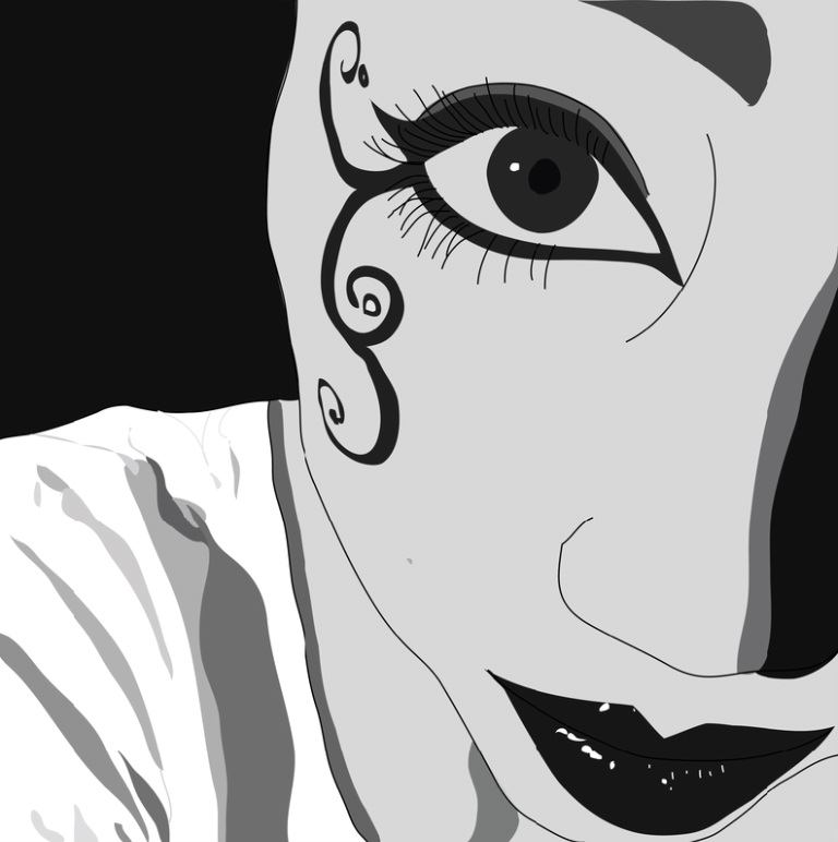
I was very committed to this project. I moved beyond just what the teacher asked of me by going into a lot of detail with this illustration, including adding things like light spots on the lips and shadows on the shirt and nose. Old technique I used was drawing basic outlines and filling in on Adobe Illustrator; new technique I used was making light spots and shadows. I related to this project because it was about/of me and my "gothic" makeup.
I was very committed to this project. I moved beyond just what the teacher asked of me by going into a lot of detail with this illustration, including adding things like light spots on the lips and shadows on the shirt and nose. Old technique I used was drawing basic outlines and filling in on Adobe Illustrator; new technique I used was making light spots and shadows. I related to this project because it was about/of me and my "gothic" makeup.
Critical C's - Creativity (2/2)
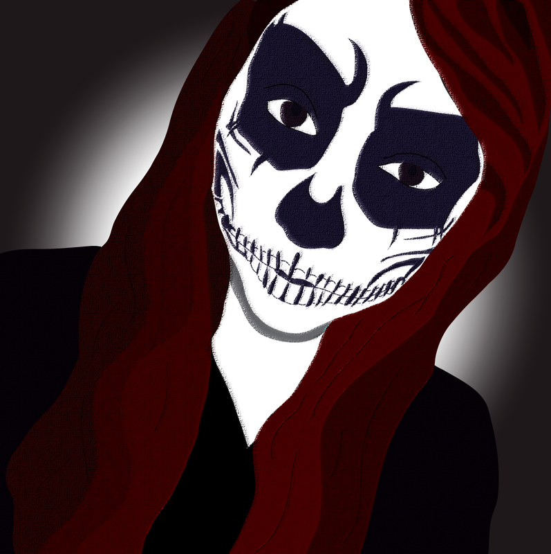
I was very committed to this project as well. I moved beyond just what the teacher asked of me by using both Adobe Illustrator and Adobe Photoshop on this photo. Old technique I used was drawing basic outlines and filling in on Illustrator; new technique I used was using filters on Adobe Photoshop. I related to this project because it was about/of me and my Halloween makeup.
I was very committed to this project as well. I moved beyond just what the teacher asked of me by using both Adobe Illustrator and Adobe Photoshop on this photo. Old technique I used was drawing basic outlines and filling in on Illustrator; new technique I used was using filters on Adobe Photoshop. I related to this project because it was about/of me and my Halloween makeup.
Craftsmanship
Critical C's - Craftsmanship (1/2)
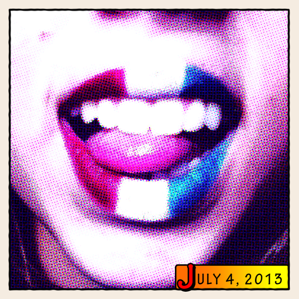
After I understood the assignment, I developed my idea by looking through all the pictures I have of my makeup. I saw this one and decided I wanted to use it. My preplanning process involved Googling Photoshop tutorials and choosing a comic effect one. To make this art, I simply followed the tutorial. It involved using the Halftone effect on Photoshop and creating borders. I also adjusted the brightness and contrast. I used the text and shape tool to make the caption. Problems I encountered was that I followed a different comic effect tutorial first and didn't like how it turned out, so I found a different comic effect tutorial to use and I liked how it came out better.
After I understood the assignment, I developed my idea by looking through all the pictures I have of my makeup. I saw this one and decided I wanted to use it. My preplanning process involved Googling Photoshop tutorials and choosing a comic effect one. To make this art, I simply followed the tutorial. It involved using the Halftone effect on Photoshop and creating borders. I also adjusted the brightness and contrast. I used the text and shape tool to make the caption. Problems I encountered was that I followed a different comic effect tutorial first and didn't like how it turned out, so I found a different comic effect tutorial to use and I liked how it came out better.
Critical C's - Craftsmanship (2/2)
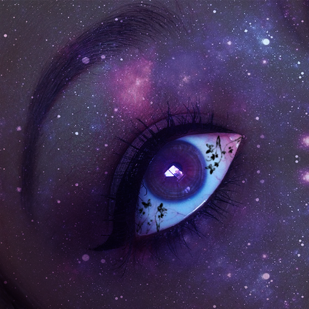
After I understood the assignment, I developed my idea by again looking through all the pictures I have of my makeup. I decided to use this one. My preplanning process involved Googling fairy-like Photoshop tutorials and choosing one. To make this art, I again followed the tutorial. It involved using the brush tool, changing layers' blending modes, creating brush presets and stamping them onto my eyeball, and overlaying the galaxy photo over the photo.
After I understood the assignment, I developed my idea by again looking through all the pictures I have of my makeup. I decided to use this one. My preplanning process involved Googling fairy-like Photoshop tutorials and choosing one. To make this art, I again followed the tutorial. It involved using the brush tool, changing layers' blending modes, creating brush presets and stamping them onto my eyeball, and overlaying the galaxy photo over the photo.
Completeness
Critical C's - Completeness (1/2)
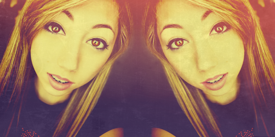
Tommy said that the picture would look better if it was mirrored, so I did that. I reflected on the element of color by making the photo very colorful with gradient overlays. I reflected on the principles of balance/pattern by mirroring the photo exactly. I knew I was finished when I thought it looked good enough to put on Weebly. I am proud of this artwork because I think it looks really cool.
Tommy said that the picture would look better if it was mirrored, so I did that. I reflected on the element of color by making the photo very colorful with gradient overlays. I reflected on the principles of balance/pattern by mirroring the photo exactly. I knew I was finished when I thought it looked good enough to put on Weebly. I am proud of this artwork because I think it looks really cool.
Critical C's - Completeness (2/2)
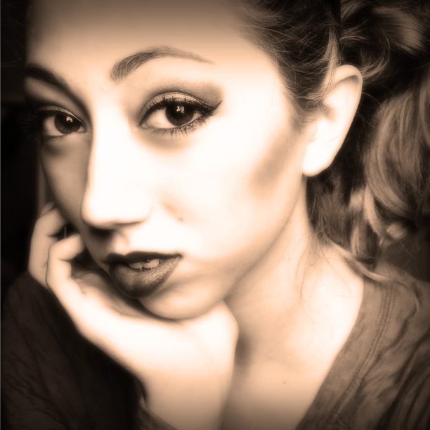
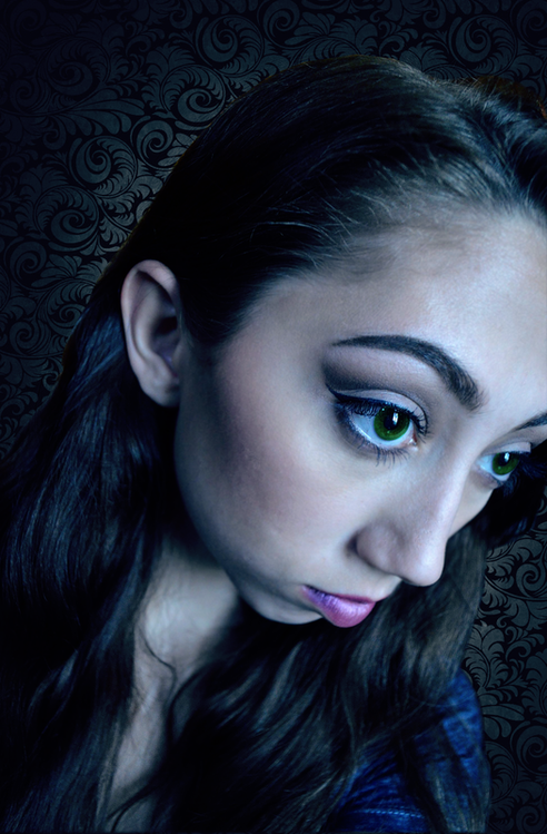
I edited my eyebrow after Tommy and Jacob said my eyebrow looked really thin. I made it look more normal. I reflected on the element of color when I made the photo sepia-toned. I reflected on the principle of emphasis when I emphasized the dark and light spots of the photo. I knew I was finished when I asked Tommy and Jacob if it looked "vintage" and they said yes. I am proud of this artwork because I think it looks glowy and vintage-y.
I edited my eyebrow after Tommy and Jacob said my eyebrow looked really thin. I made it look more normal. I reflected on the element of color when I made the photo sepia-toned. I reflected on the principle of emphasis when I emphasized the dark and light spots of the photo. I knew I was finished when I asked Tommy and Jacob if it looked "vintage" and they said yes. I am proud of this artwork because I think it looks glowy and vintage-y.
Concept
Critical C's - Concept (1/2)
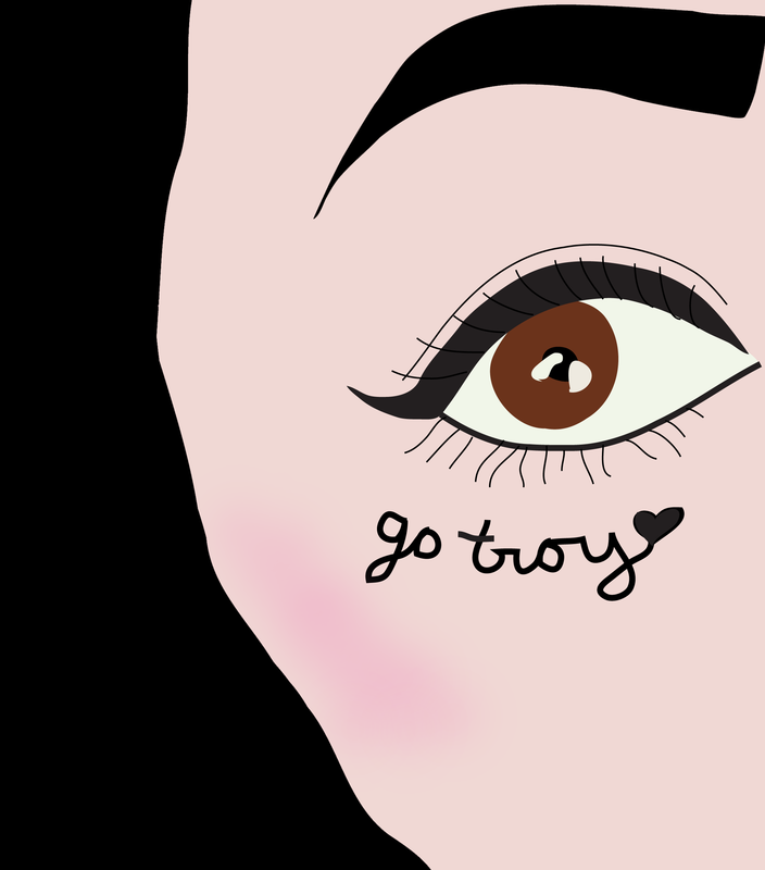
This artwork appealed to me because it was an opportunity for me to showcase my makeup and make it look good. I disliked this project because it's hard to draw makeup on Adobe Illustrator. In this particular artwork, it is not apparent that my hair and eyebrow were actually both blonde at the time. It also might not be apparent that the "go troy" was written in liquid eyeliner.
This artwork appealed to me because it was an opportunity for me to showcase my makeup and make it look good. I disliked this project because it's hard to draw makeup on Adobe Illustrator. In this particular artwork, it is not apparent that my hair and eyebrow were actually both blonde at the time. It also might not be apparent that the "go troy" was written in liquid eyeliner.
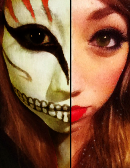
Critical C's - Concept (2/2)
This artwork appealed to me because it seemed like it would be easy to do since my face was already "half-evil, half-good" for Halloween. I disliked doing this artwork because the photo was kind of bad quality so it was hard to make it look good. It might not be apparent to the audience that this picture is only one whole picture, not two separate ones. Also my skin and eyes on the left side are Photoshopped and did not look that "evil" or "dead" in real life.
This artwork appealed to me because it seemed like it would be easy to do since my face was already "half-evil, half-good" for Halloween. I disliked doing this artwork because the photo was kind of bad quality so it was hard to make it look good. It might not be apparent to the audience that this picture is only one whole picture, not two separate ones. Also my skin and eyes on the left side are Photoshopped and did not look that "evil" or "dead" in real life.
Composition
Critical C's - Composition (1/2)
I used the elements of color, value, and form in my composition. I also used the principles of contrast and emphasis. My artwork is a personal reflection because it is of myself. The most dominant principle I used was emphasis. This affects the composition by drawing the viewers' attention to my face, specifically to my eyes/cheekbones. I used Adobe Photoshop.
I used the elements of color, value, and form in my composition. I also used the principles of contrast and emphasis. My artwork is a personal reflection because it is of myself. The most dominant principle I used was emphasis. This affects the composition by drawing the viewers' attention to my face, specifically to my eyes/cheekbones. I used Adobe Photoshop.
Critical C's - Composition (2/2)
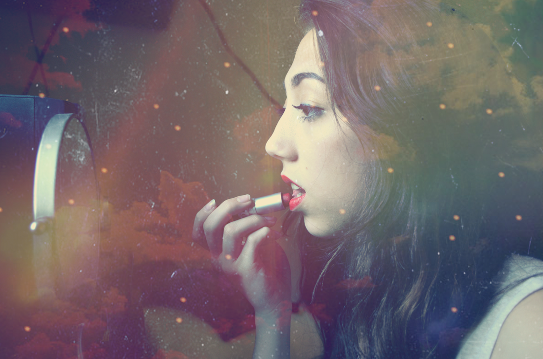
I used the elements of color, texture, and form in my composition. I also used the principles of pattern and rhythm. My artwork is a personal reflection because it is again of myself. The most dominant principle I used was rhythm. This affects the composition by giving it a slow-ish "rhythm" because of all the clouds and spaced out light specks. I used Adobe Photoshop.
I used the elements of color, texture, and form in my composition. I also used the principles of pattern and rhythm. My artwork is a personal reflection because it is again of myself. The most dominant principle I used was rhythm. This affects the composition by giving it a slow-ish "rhythm" because of all the clouds and spaced out light specks. I used Adobe Photoshop.
