Handmade Poster: Graphically Speaking
Critical C's
Concept
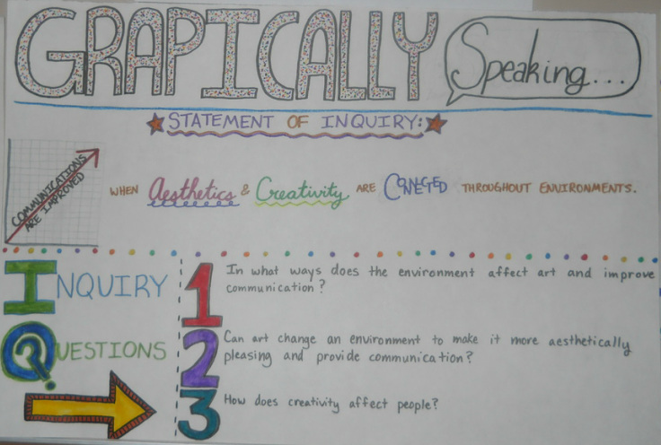
I like designing posters because I get to be creative and arrange the elements the way I want them. I especially like designing typography, and making a poster gave me an opportunity to do that. I didn't really like that we weren't using computers, because I like being able to make things perfect, and I can't do that when I'm drawing on a real piece of paper. I chose the bright, colorful theme because I wanted to make the poster look interesting, exciting, and I wanted it to catch people's eyes.
Composition
I used line in the underlining of some words, the border between two different sections, and where I drew a small graph. I used color all over my poster, in my bright color choice for words, numbers, and small graphics, such as the graph, the stars, and the rainbow circle border. I used texture in the word "GRAPHICALLY," by filling it with many multicolor dots, which make it look like it has texture. I used shape in my speech bubble in the title, which is oval-like. I used pattern in the recurring rainbow color pattern of the circle border. I used movement with arrows that point the eye to different parts of the poster. I used unity because the color scheme is relatively the same throughout, which gives it a sense of unity. When I look at my artwork I would say that it is a personal reflection because it's all based on designs and colors that I like. The most dominant principle I used is unity because it all looks tied together and related. It effects the composition by making it look appealing to the eye. I used drawing.
Craftsmanship
I developed my idea by planning it out on a piece of paper beforehand. I pretty much just drew whatever came to mind. I just thought about what would look good and tried it out. Then, I drew it all out on big paper in pencil, making some minor changes to the design, and afterwards colored it all with markers. Issues/Problems I encountered were trying to fit it all on the page without there being much empty space. I solved these issues by changing my original design a little to make it all fit on the page better.
Creativity
I was very committed to this project - I like posters and wanted to make it look good. I put a lot of planning and effort into this project and spent a lot of time on it. I tried to make it pretty detailed and colorful, and I made it more than just all words - for example, I drew a graph. I was not used to drawing on paper, I am used to using computers, so it was somewhat new to me. I used old technique because I have made many posters before. I related to this project because I am experienced with posters and I like them.
Completeness
I didn't change my artwork as a result of looking at someone else's work or talking with a student/teacher. I reflect on the elements and principles of art when creating my artwork by thinking about what will be the most aesthetically pleasing in terms of them. I especially think about space, because I try to make sure everything is evenly spaced and that there is not too much empty space. I changed my design a little to fix the spacing. I knew I was finished when I looked at it and thought that there was nothing else that could be added to make it better (in the time I had to do it, anyways). I am proud because I think it looks pretty good for the time I had to do it, and I think that it would appeal to others as well.
Concept
I like designing posters because I get to be creative and arrange the elements the way I want them. I especially like designing typography, and making a poster gave me an opportunity to do that. I didn't really like that we weren't using computers, because I like being able to make things perfect, and I can't do that when I'm drawing on a real piece of paper. I chose the bright, colorful theme because I wanted to make the poster look interesting, exciting, and I wanted it to catch people's eyes.
Composition
I used line in the underlining of some words, the border between two different sections, and where I drew a small graph. I used color all over my poster, in my bright color choice for words, numbers, and small graphics, such as the graph, the stars, and the rainbow circle border. I used texture in the word "GRAPHICALLY," by filling it with many multicolor dots, which make it look like it has texture. I used shape in my speech bubble in the title, which is oval-like. I used pattern in the recurring rainbow color pattern of the circle border. I used movement with arrows that point the eye to different parts of the poster. I used unity because the color scheme is relatively the same throughout, which gives it a sense of unity. When I look at my artwork I would say that it is a personal reflection because it's all based on designs and colors that I like. The most dominant principle I used is unity because it all looks tied together and related. It effects the composition by making it look appealing to the eye. I used drawing.
Craftsmanship
I developed my idea by planning it out on a piece of paper beforehand. I pretty much just drew whatever came to mind. I just thought about what would look good and tried it out. Then, I drew it all out on big paper in pencil, making some minor changes to the design, and afterwards colored it all with markers. Issues/Problems I encountered were trying to fit it all on the page without there being much empty space. I solved these issues by changing my original design a little to make it all fit on the page better.
Creativity
I was very committed to this project - I like posters and wanted to make it look good. I put a lot of planning and effort into this project and spent a lot of time on it. I tried to make it pretty detailed and colorful, and I made it more than just all words - for example, I drew a graph. I was not used to drawing on paper, I am used to using computers, so it was somewhat new to me. I used old technique because I have made many posters before. I related to this project because I am experienced with posters and I like them.
Completeness
I didn't change my artwork as a result of looking at someone else's work or talking with a student/teacher. I reflect on the elements and principles of art when creating my artwork by thinking about what will be the most aesthetically pleasing in terms of them. I especially think about space, because I try to make sure everything is evenly spaced and that there is not too much empty space. I changed my design a little to fix the spacing. I knew I was finished when I looked at it and thought that there was nothing else that could be added to make it better (in the time I had to do it, anyways). I am proud because I think it looks pretty good for the time I had to do it, and I think that it would appeal to others as well.
