Adobe Illustrator Word Animal: Sloth
Critical C's
Concept
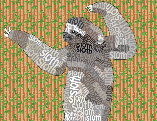
This project appealed to me because I got to try something that I've never done before. I disliked having to warp all the letters to fit inside the sloth because it took me a long time. It is not apparent to the audience that I had to freehand its claws because with the way the picture was taken, it didn't look good when I just outlined how the claws looked originally.
Composition
I used the elements of line, color, and shape, and the principles of pattern, rhythm, and movement in my composition. My artwork is a personal reflection because I really like sloths and I am lazy, like sloths. The most dominant principle I used is rhythm because the background and the "sloth" texts are all very close together and the way they are arranged cause the viewers to see a fast rhythm. It affects my composition by making the viewers see the artwork as fast-moving and more exciting/energetic. The medium I used was Adobe Illustrator.
Craftsmanship
After I understood the assignment I developed my idea by thinking about what animals I like. For my preplanning process I searched the Internet to find pictures of said animals and then decided which one I wanted to make a word animal of, which was the sloth. Then, I asked my peers which picture of a sloth I should use. To make the art, I first outlined the whole body of the sloth. Then, I outlined and filled in small features such as his eye, nostril, and mouth. To fill the animal, I typed the word "sloth," picked a color from the area the word was going with the color picker, then placed it there, clicked "Create Outlines," "Ungroup," and warped/altered the size/shape of the letters. I did this until the animal was full. I added a background in another layer using a rectangle shape. The last thing I did was draw its claws. An issue I encountered was drawing said claws; when I just outlined how they looked originally it looked really weird. I solved this issue by simply freehanding them.
Creativity
I was very committed to this project; I wanted to get it done and make it look good. I moved beyond "just what the teacher asked of me" by altering the size of EVERY single letter inside this animal. Most people didn't do that, and she didn't require that we did, but I did it anyways to make it look good. A new technique I used was the whole "Create Outlines," "Ungroup," then warping the letters thing. Old techniques I used were outlining the animal's shape with the pencil tool, and also making its background with the rectangle tool. I related to this project because the sloth is one of my favorite animals, so I enjoyed making one into a word animal.
Completeness
I changed my artwork as a result of looking at someone else's work when I filled the animal outline with gray. I wasn't going to fill the shape with color, but I saw on the wall that a lot of people had done that and that it looked good. I reflected on the elements of line as I outlined the shapes, color as I filled the shapes and the background and as I color-picked the words, and shape as I created the shape of my animal. I reflected on the principles of pattern when I chose my background with a recurring pattern, and rhythm and movement when I chose the background and arranged the text in a certain way to make the artwork look exciting. I knew when I was finished because the whole animal was filled in with text and it had a background. I am proud of my artwork because I think it looks pretty good and cool.
Concept
This project appealed to me because I got to try something that I've never done before. I disliked having to warp all the letters to fit inside the sloth because it took me a long time. It is not apparent to the audience that I had to freehand its claws because with the way the picture was taken, it didn't look good when I just outlined how the claws looked originally.
Composition
I used the elements of line, color, and shape, and the principles of pattern, rhythm, and movement in my composition. My artwork is a personal reflection because I really like sloths and I am lazy, like sloths. The most dominant principle I used is rhythm because the background and the "sloth" texts are all very close together and the way they are arranged cause the viewers to see a fast rhythm. It affects my composition by making the viewers see the artwork as fast-moving and more exciting/energetic. The medium I used was Adobe Illustrator.
Craftsmanship
After I understood the assignment I developed my idea by thinking about what animals I like. For my preplanning process I searched the Internet to find pictures of said animals and then decided which one I wanted to make a word animal of, which was the sloth. Then, I asked my peers which picture of a sloth I should use. To make the art, I first outlined the whole body of the sloth. Then, I outlined and filled in small features such as his eye, nostril, and mouth. To fill the animal, I typed the word "sloth," picked a color from the area the word was going with the color picker, then placed it there, clicked "Create Outlines," "Ungroup," and warped/altered the size/shape of the letters. I did this until the animal was full. I added a background in another layer using a rectangle shape. The last thing I did was draw its claws. An issue I encountered was drawing said claws; when I just outlined how they looked originally it looked really weird. I solved this issue by simply freehanding them.
Creativity
I was very committed to this project; I wanted to get it done and make it look good. I moved beyond "just what the teacher asked of me" by altering the size of EVERY single letter inside this animal. Most people didn't do that, and she didn't require that we did, but I did it anyways to make it look good. A new technique I used was the whole "Create Outlines," "Ungroup," then warping the letters thing. Old techniques I used were outlining the animal's shape with the pencil tool, and also making its background with the rectangle tool. I related to this project because the sloth is one of my favorite animals, so I enjoyed making one into a word animal.
Completeness
I changed my artwork as a result of looking at someone else's work when I filled the animal outline with gray. I wasn't going to fill the shape with color, but I saw on the wall that a lot of people had done that and that it looked good. I reflected on the elements of line as I outlined the shapes, color as I filled the shapes and the background and as I color-picked the words, and shape as I created the shape of my animal. I reflected on the principles of pattern when I chose my background with a recurring pattern, and rhythm and movement when I chose the background and arranged the text in a certain way to make the artwork look exciting. I knew when I was finished because the whole animal was filled in with text and it had a background. I am proud of my artwork because I think it looks pretty good and cool.
